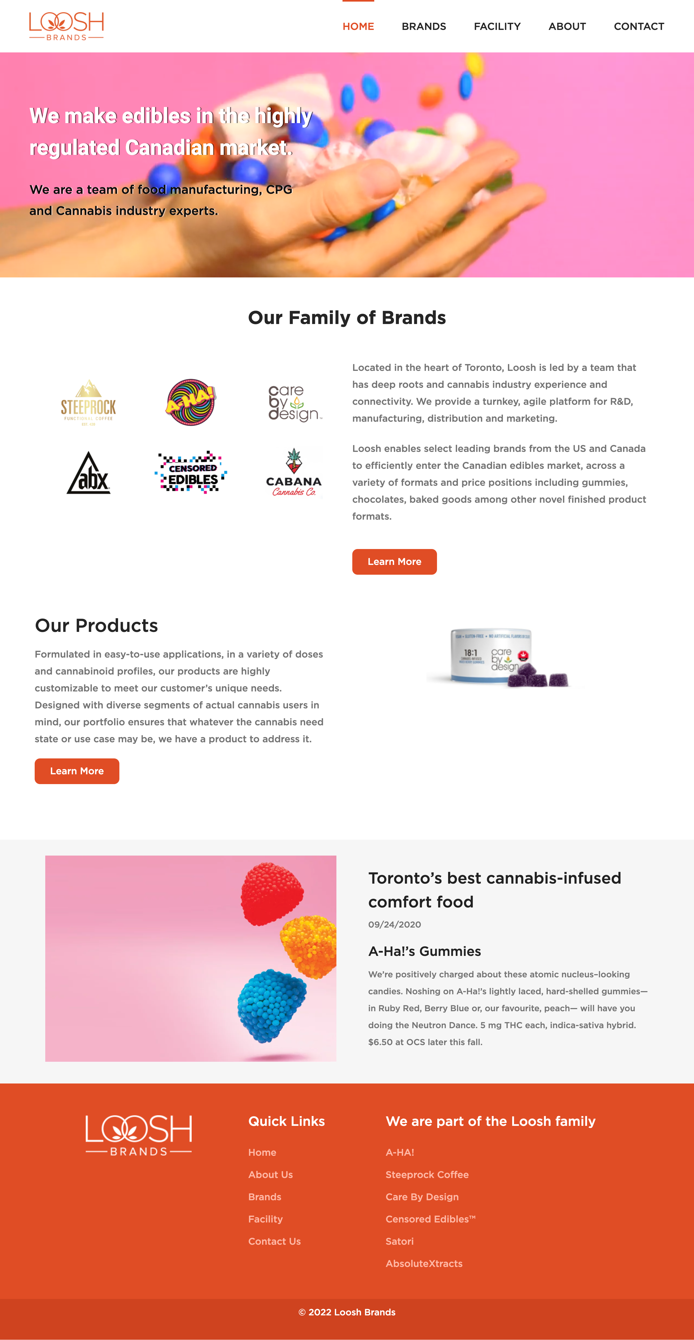
Loosh Brands is a cannabis company based in Toronto that specializes in R&D, manufacturing, distribution, and marketing. With deep roots and experience in the cannabis industry.
Client: Loosh Brands
Contribution: User Experience Design, Website Modification (WordPress, Elementor and WooCommerce)
Task
During the three-month project, my primary objective was to improve the usability and user experience of Loosh Brands' website. The company wanted to ensure that the website was easy to understand and effectively communicated its brand identity, including the ten brands under its name. Additionally, the client was keen on promoting the company to potential business customers, such as cannabis stores like Tokyo Smoke and OCS.
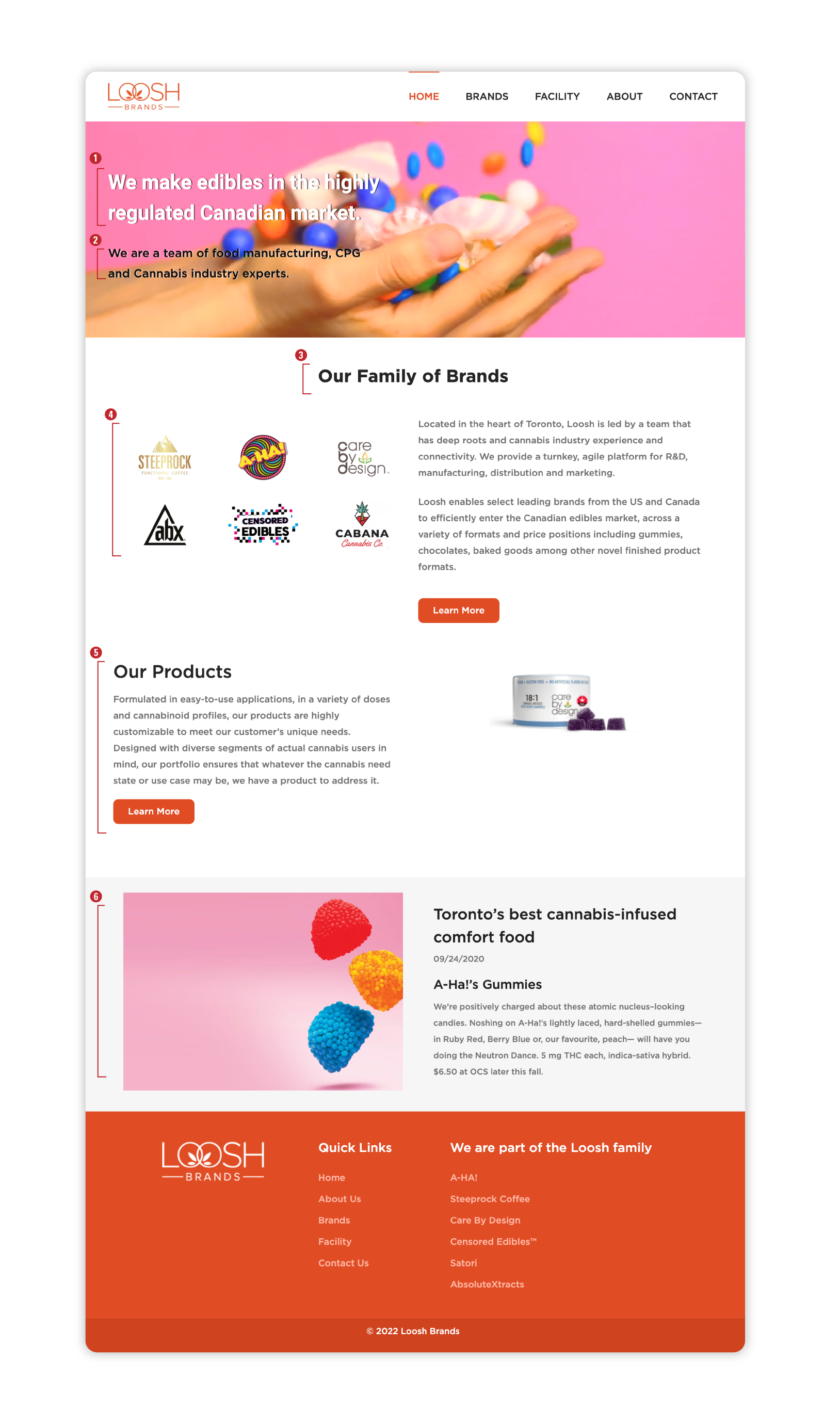
To better showcase the company’s identity and products, I implemented a number of key improvements. Here’s a summary of what I did:
- Rewrote the headline to be more concise and clearly convey Loosh Brands’ purpose.
- Rewrote the subheadline to provide support for the headline and explain who Loosh Brands is.
- Added a “Our Family of Brands” section to give users an overview of Loosh Brands’ identity and draw a connection between the user and the brand.
- Changed the logos’ appearance method from a carousel to an overview look, making it easier for users to view.
- Added a brand new section showcasing all of Loosh’s products, allowing users to easily browse and discover the different offerings.
- Added an article section to increase recognition and establish the company’s credibility.
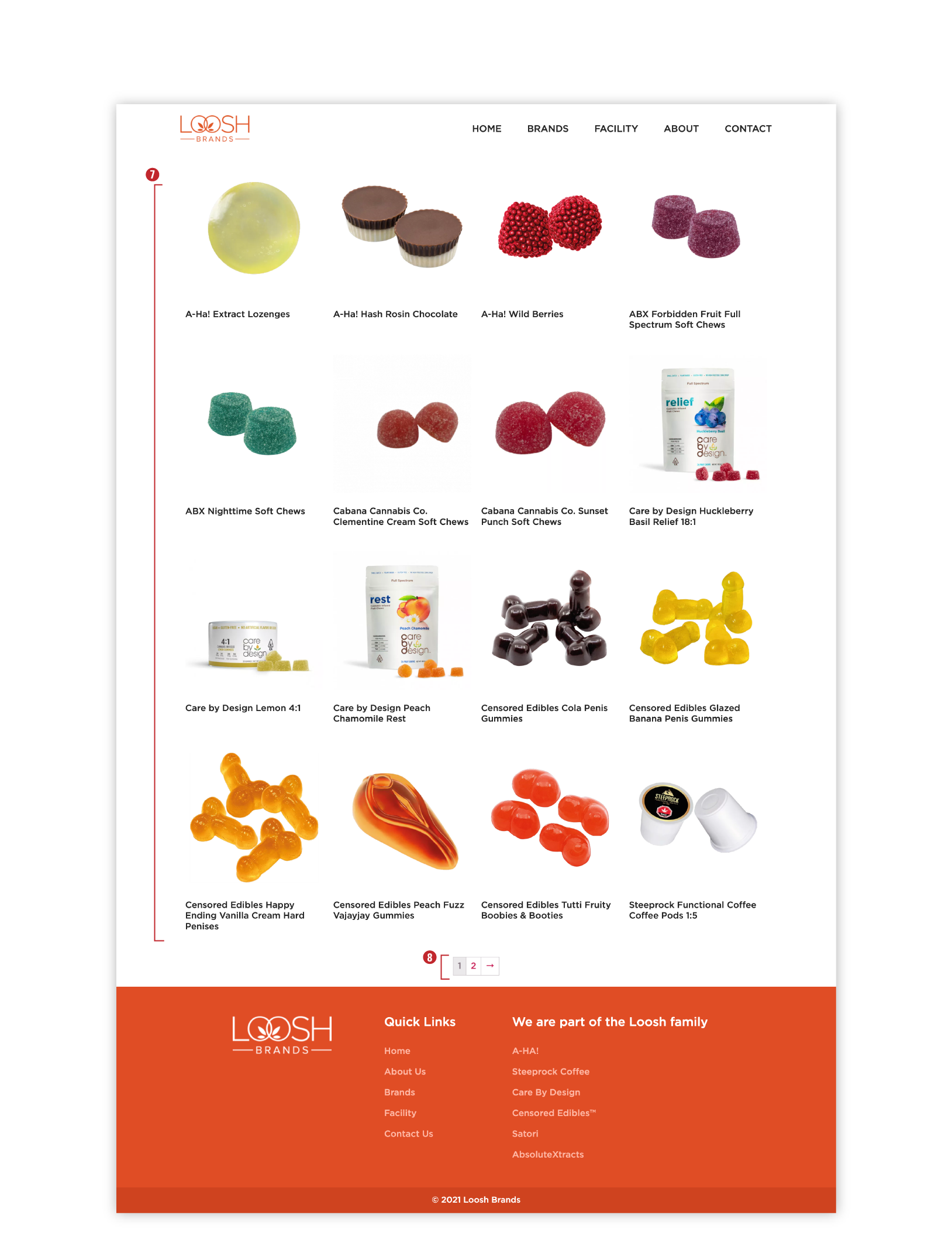
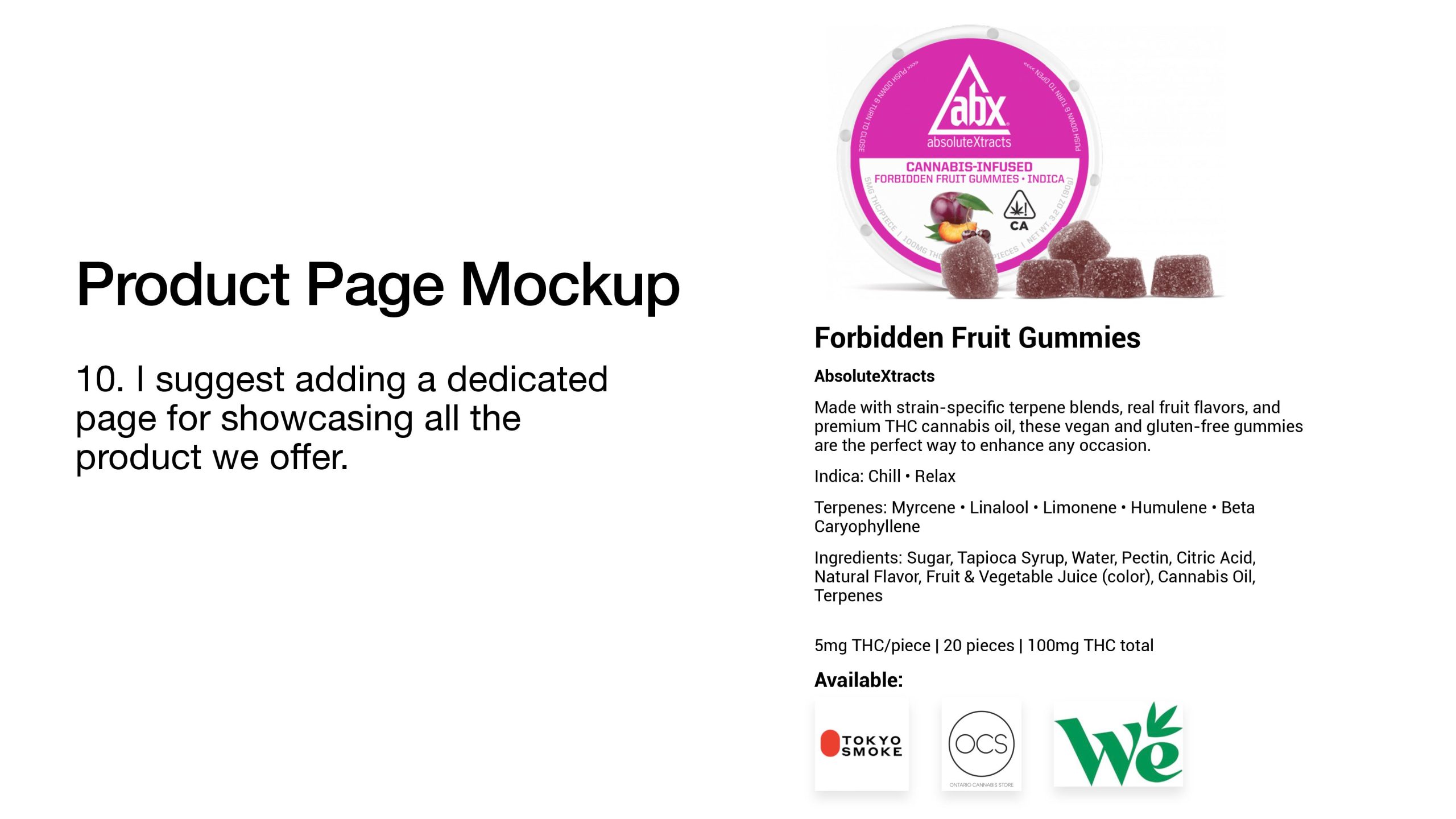
7. Created a brand new page showcasing all of the products, using a WordPress plugin called WooCommerce, and set up the entire backend for the company to add products in a simple and quick manner.
8. Created easy-to-use navigation that allows users to quickly and easily find what they are looking for.
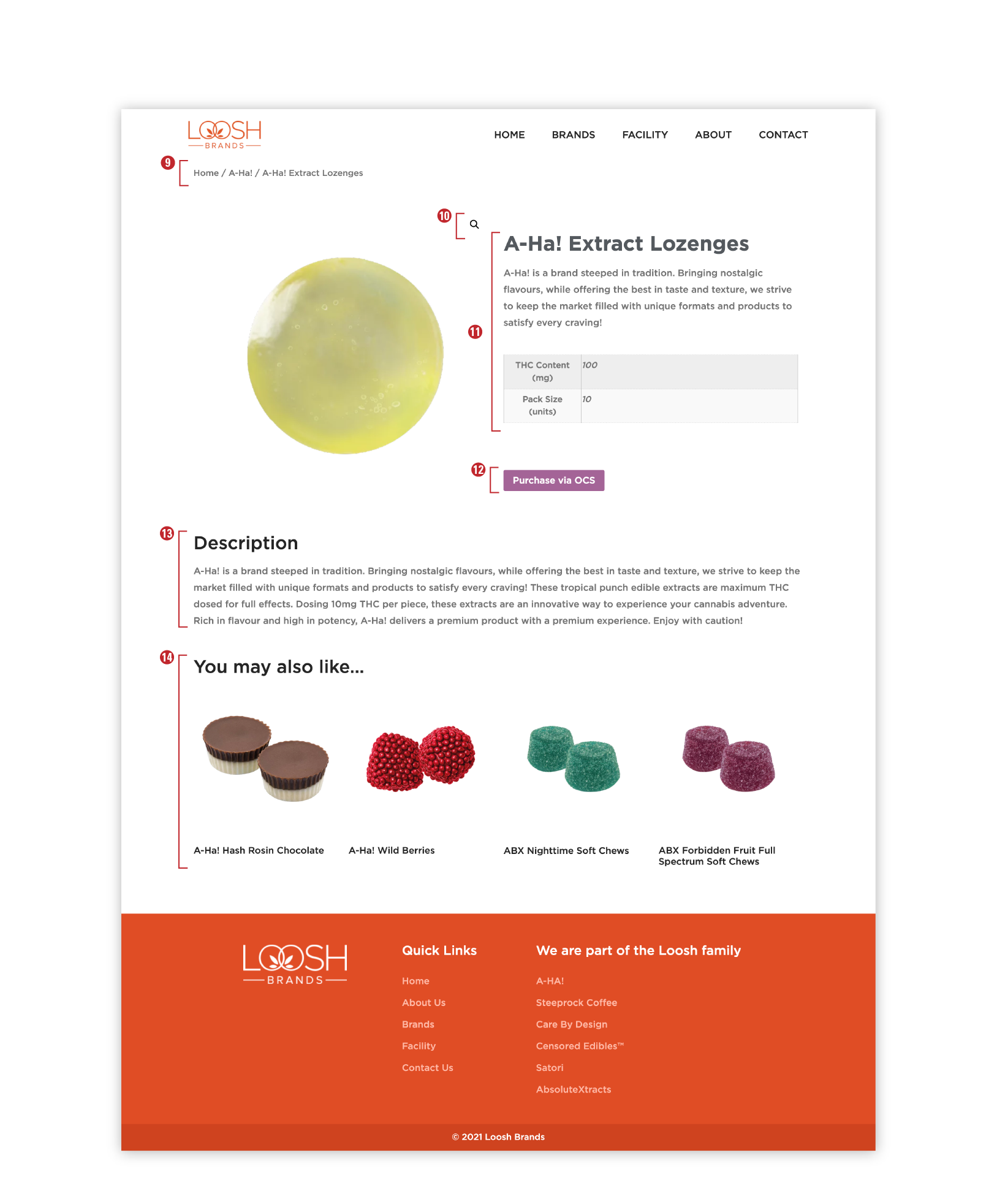
9. Added a breadcrumb feature to help users navigate the website and find their way back to previously visited pages.
10. Implemented an image preview and lightbox feature, allowing users to view product images in greater detail.
11. Included basic product information, such as THC content and pack size, to help users make informed decisions.
12. Included a clear call to action for users to purchase if they are interested.
13. Provided detailed product descriptions to help users better understand each offering.
14. Added a “You may also like…” section to help users navigate Loosh Brands’ offerings and discover related products.
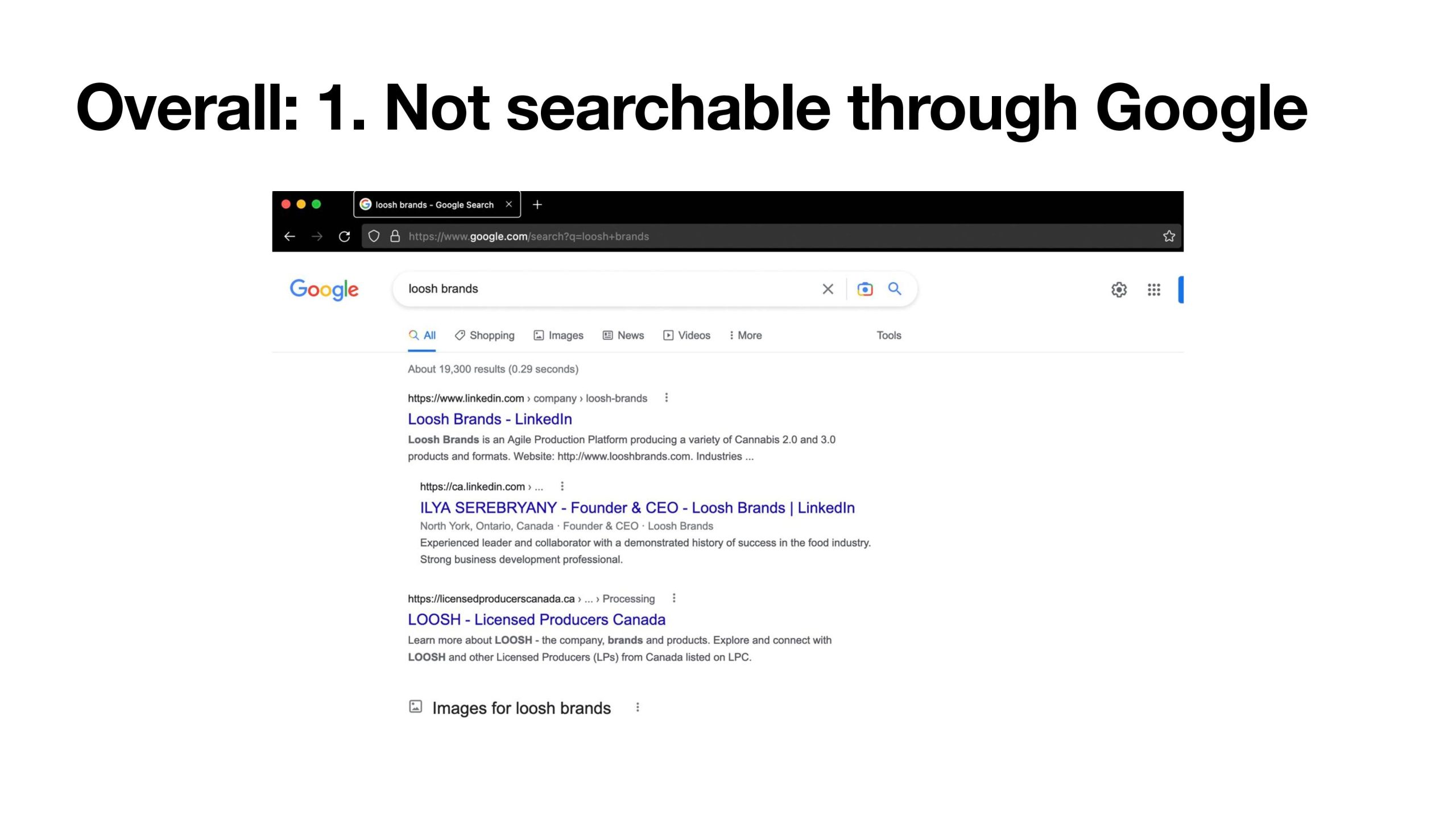
To begin with, I identified several areas for improvement and made changes through the website’s backend (WordPress). The first and most significant issue was that their website was not searchable through Google, due to a setting that had accidentally been turned off.
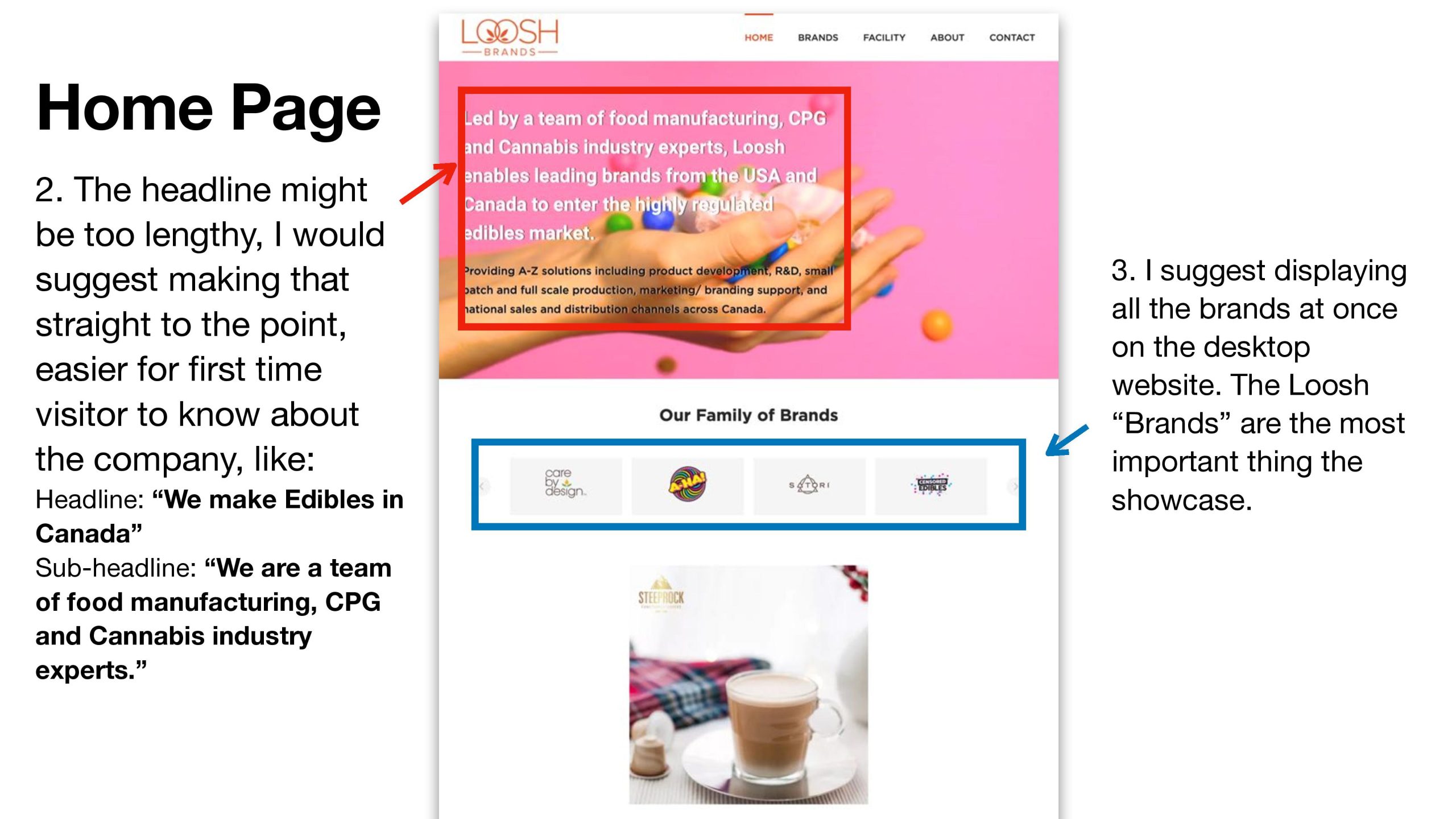
I also based my approach on the Usability Heuristics for User Interface Design, which helped me to improve the website’s usability in a number of ways. For example, I suggested shortening the headline to make it more straightforward and easier for first-time visitors to understand, and displaying all the brands at once on the desktop website. I also recommended showcasing the signature products in a grid view, with product names, images, and cannabinoid information.
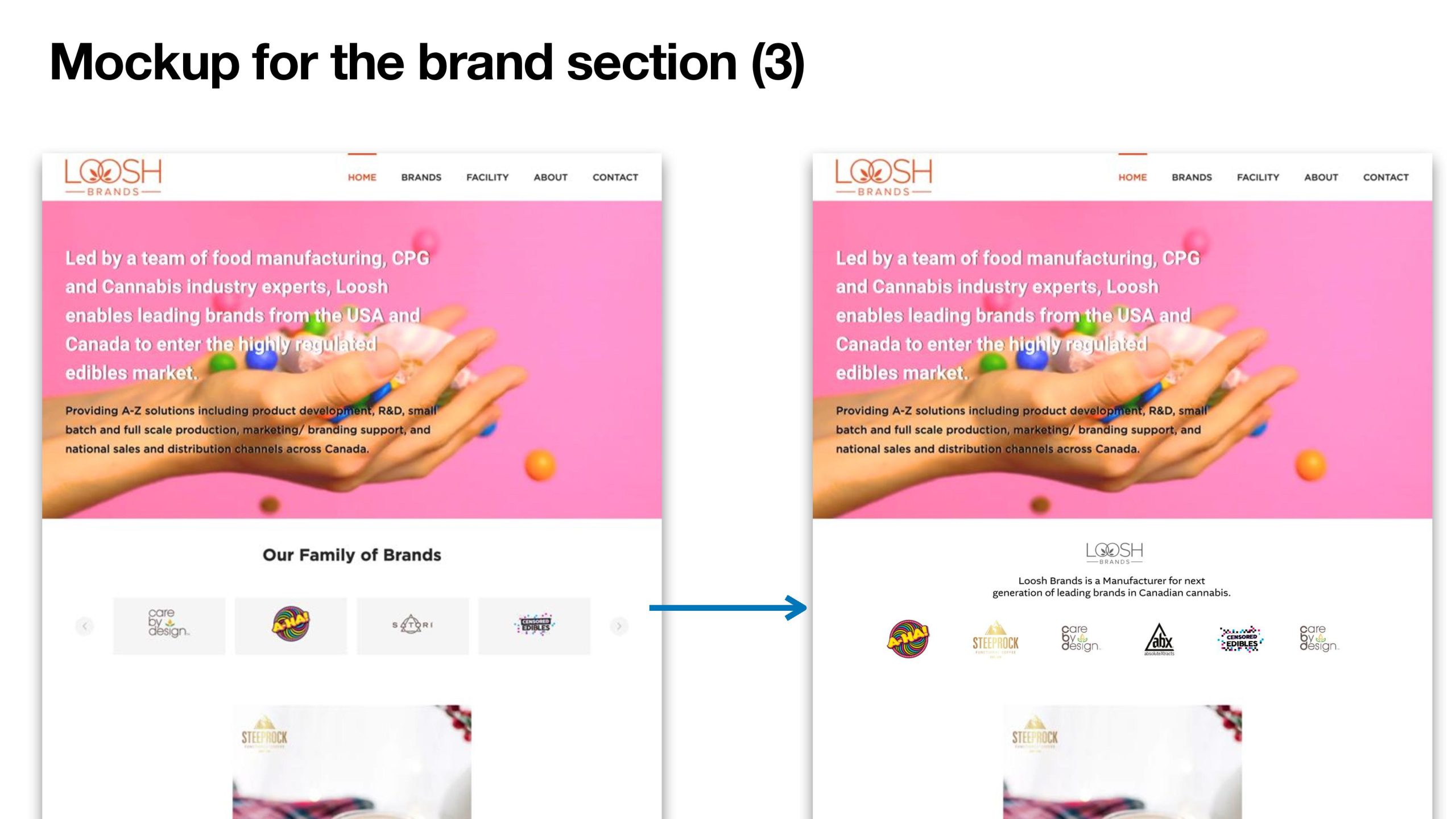
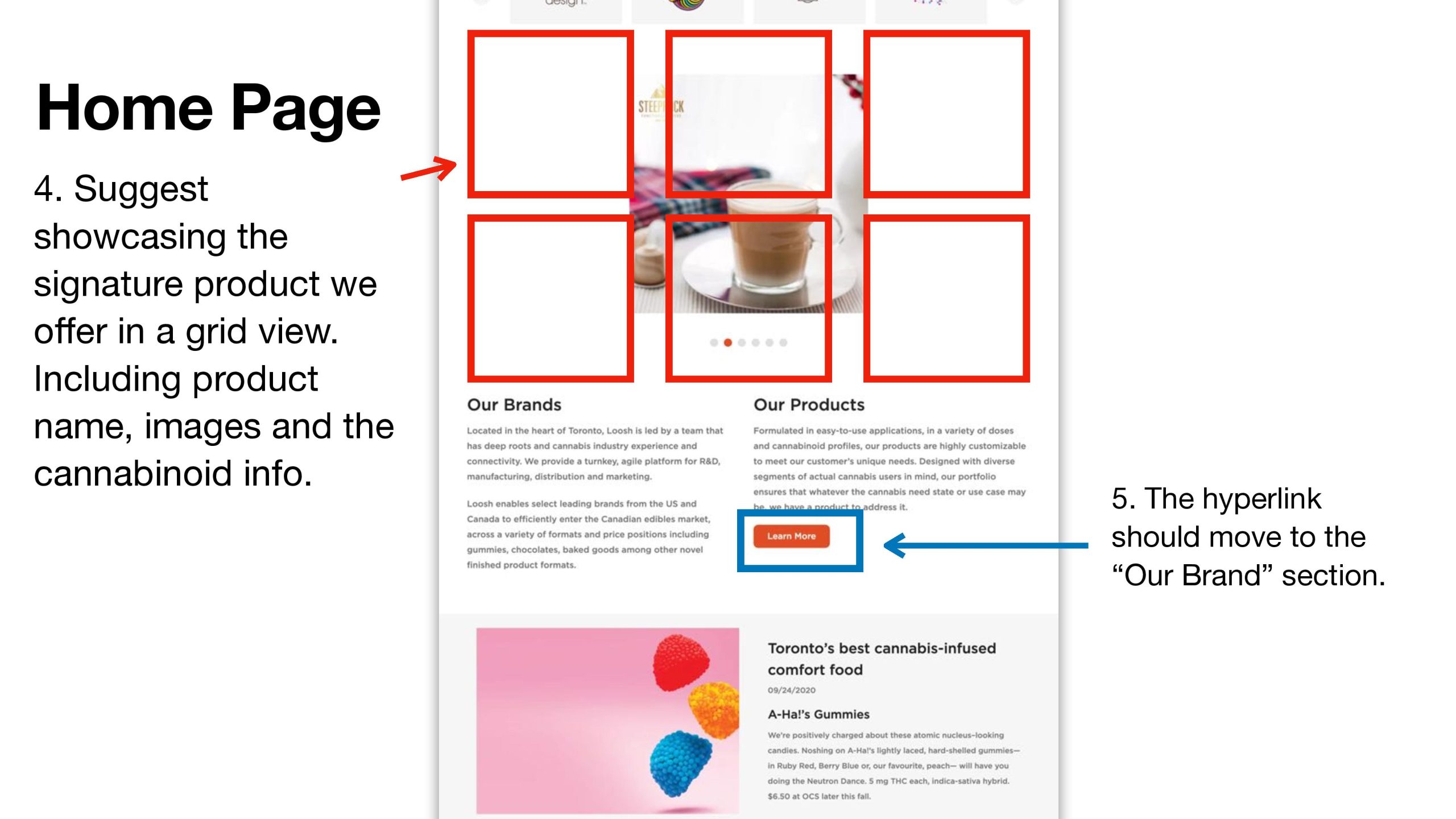
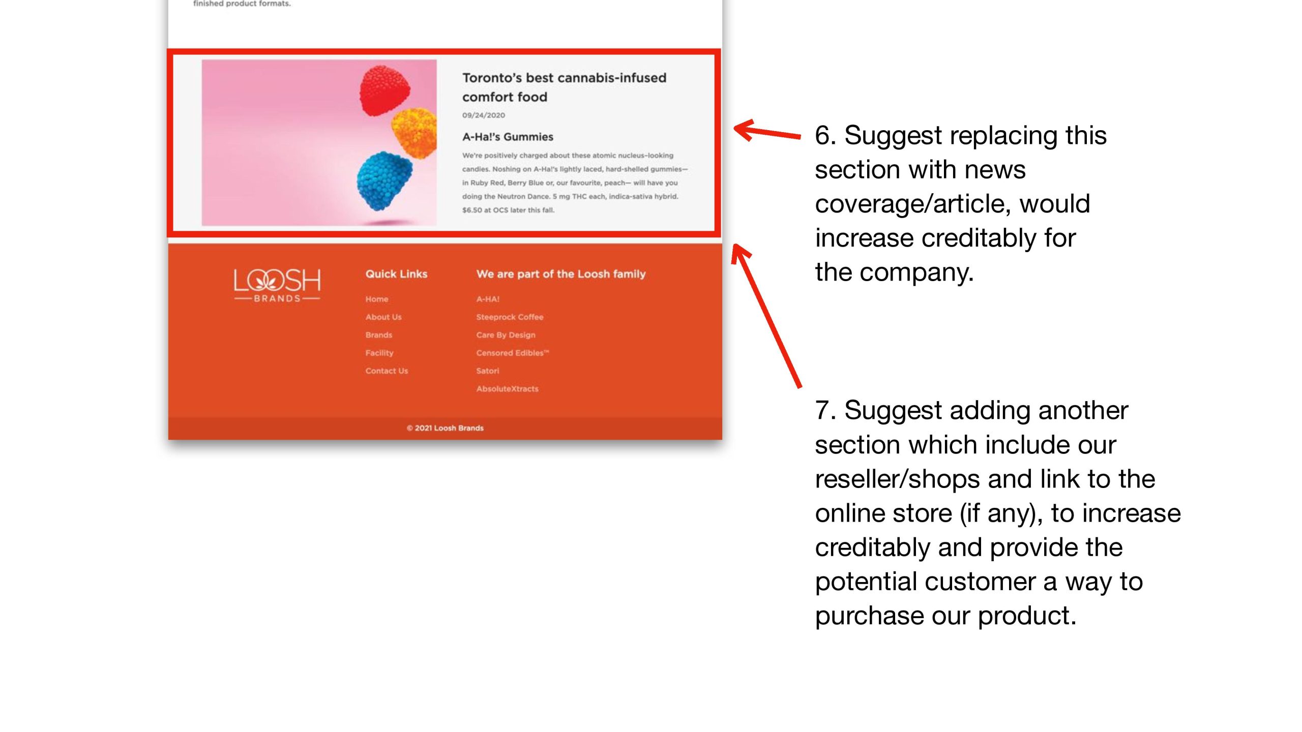
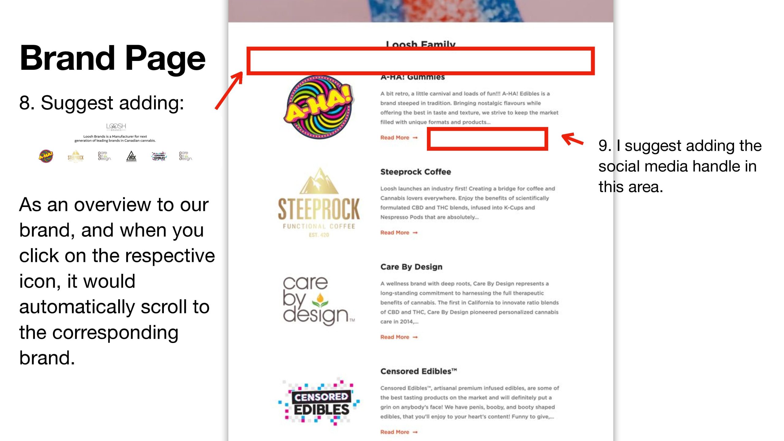
Other improvements included adding a dedicated page to showcase all of the products on offer, adding a section to include resellers/shops and links to online stores, and adding a news coverage/article section to increase credibility. Finally, I recommended adding an overview of the brand, with clickable icons that would automatically scroll to the corresponding brand and display their social media handle.
After many rounds of discussion and meetings with various colleagues at Loosh Brands, I successfully implemented these changes, resulting in a much more user-friendly and visually appealing website. This project allowed me to gain valuable experience in web design and user experience, and I am proud to have contributed to the success of the Loosh Brands website.
